April 8th, 2018
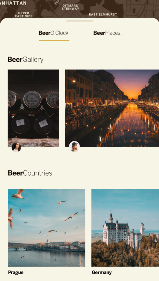
BierDiet App
The app is designed to delight the true beer connoisseur and those who are enjoying occasional one or two beers after work.
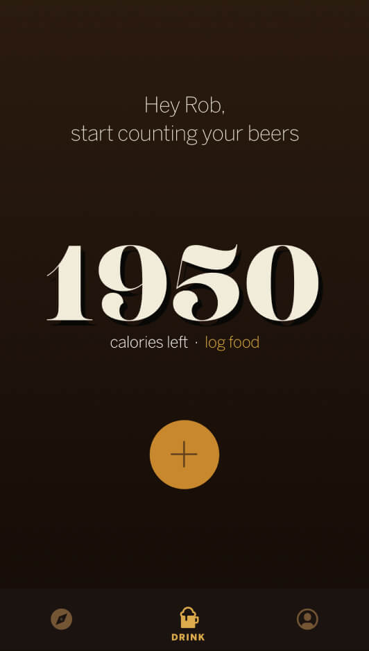
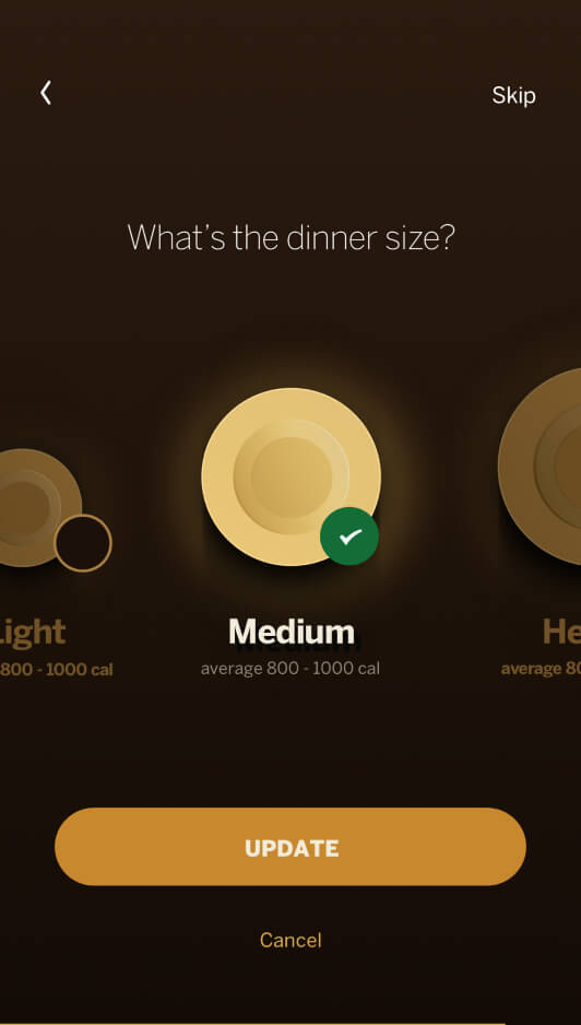
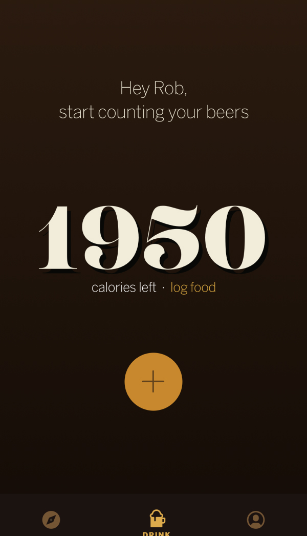
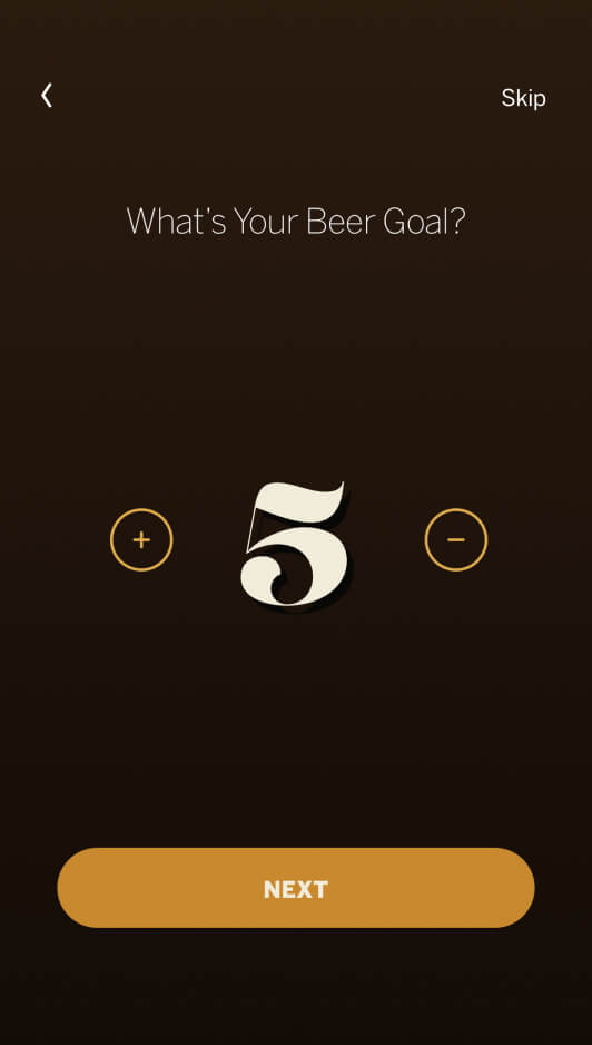
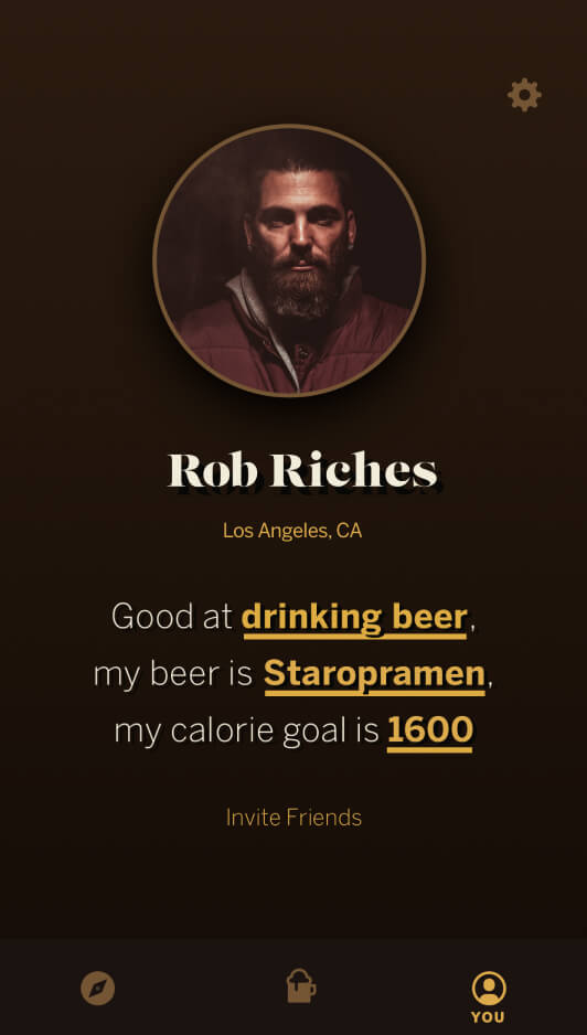
The app is designed to unite the true beer connoisseur and those who are enjoying occasional one or two beers after work while being conscious about the calorie intake.
The story of humanity’s love affair with alcohol goes back to a time before farming—to a time before humans. I wanted to celebrate the legacy of the drinking culture, beer-drinking culture with classy tones, significant and impactful typography, respectful and regal tone of voice with a bit of a modern flare.
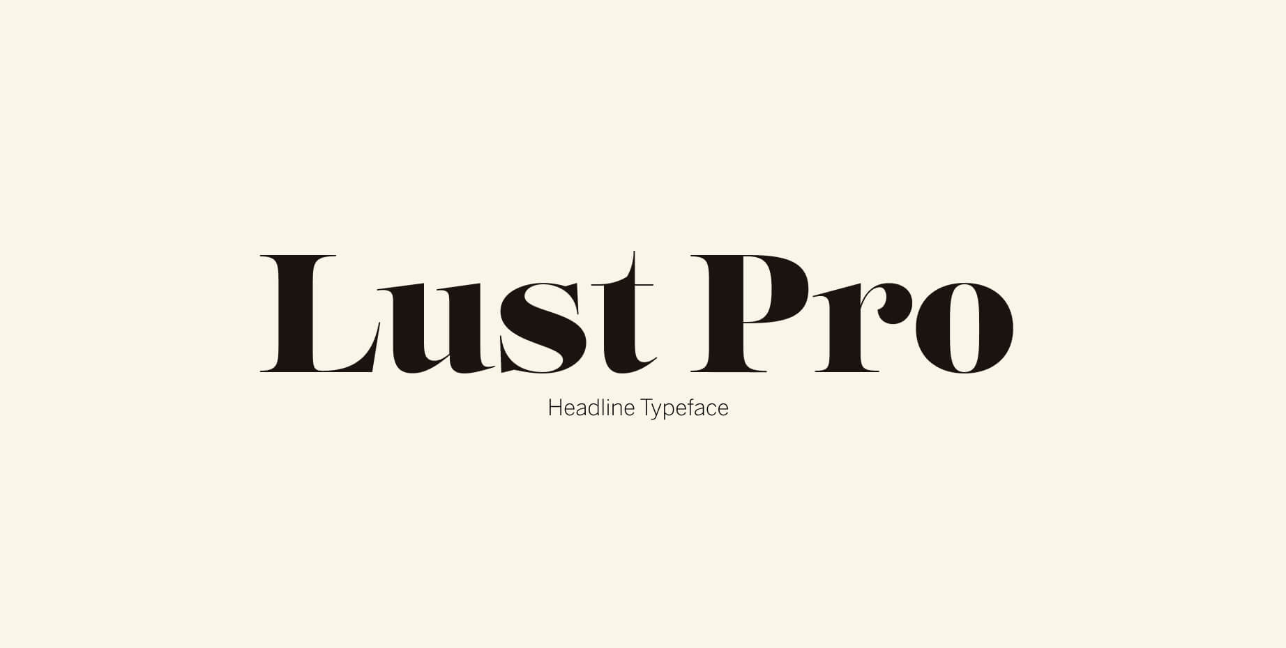
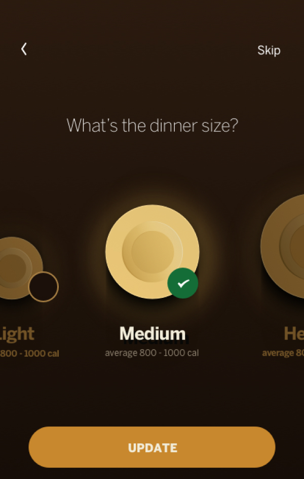
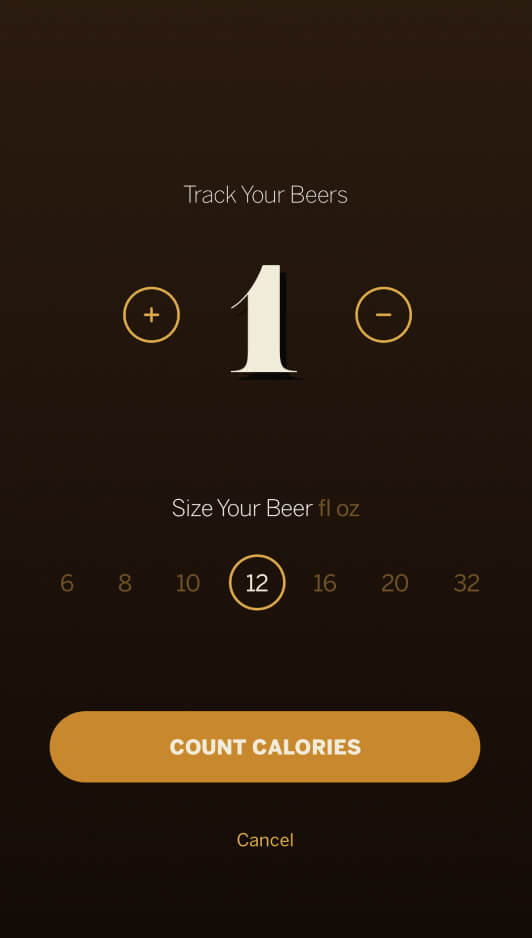
For the typographical expression, I deliberately chose Lust Pro typeface designed by Neil Summerour. As he describes it: "Confident and versatile, Lust Pro™ is an exercise in indulgence—an attempt to create something over the top and vastly useful." I could not think of any better font for the headings.
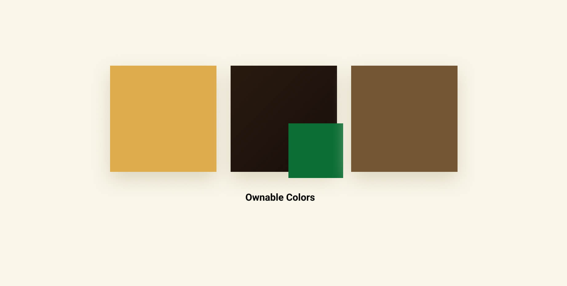
The color palette relies on the conventional earthy tones, calming brown, green, yellow palette to express a wide variety of beers in the world and ensure accessibility of that color throughout the entire experience.